One of my biggest passions (aside from photographing couples in love) is educating other women in photography and/or business to follow their biggest dreams. This is why I started The Prosper Workshop! I’ve hosted three workshops now, and each one has continued to get even better and has filled my heart a little more with every event. There is something so powerful about having a group of women come together to support each other. I will get more into the details of the workshop itself in an upcoming blog ALL about it. But perhaps my favorite part of the day is the styled shoot that I put together! It is so fun to get to design and plan a “wedding,” especially now that my own has come and gone.
For this particular shoot, I wanted to choose a color palette that translated well from winter to spring since we would be hosting the workshop in February. I created a Pinterest board of inspiration and reached out to many of my FAVORITE local vendors to ask if they would want to partake. I was SO excited that they were all on board because I knew that with their talent and expertise they were going to blow it out of the water. And boy, they did not disappoint!
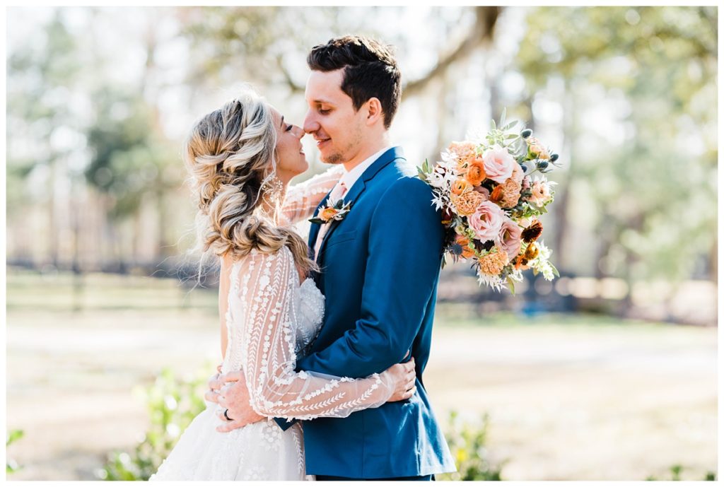
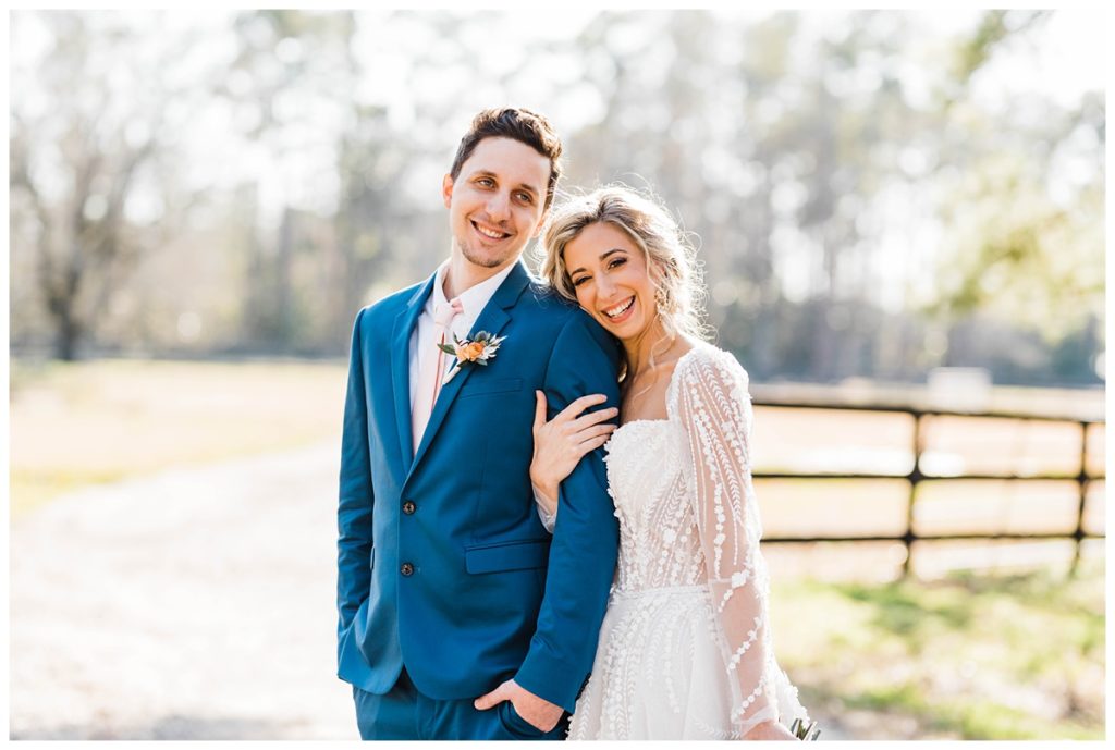
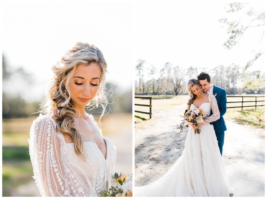
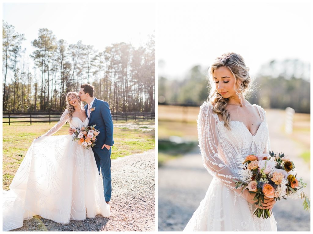
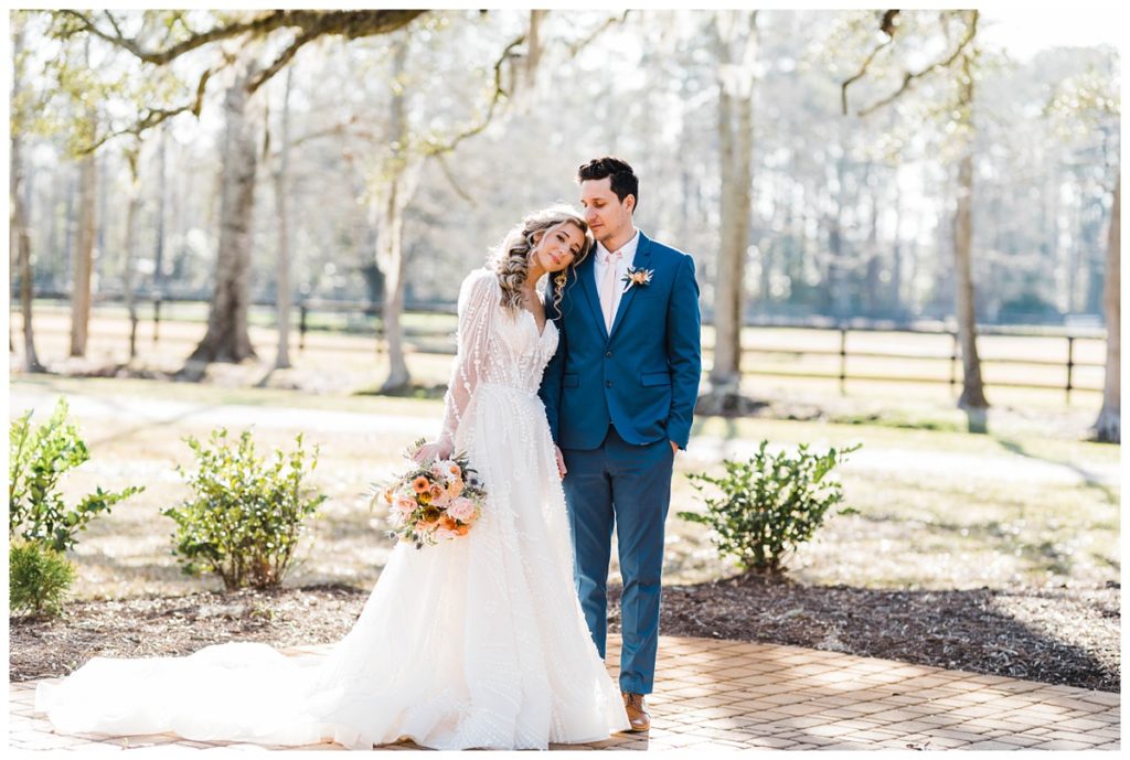
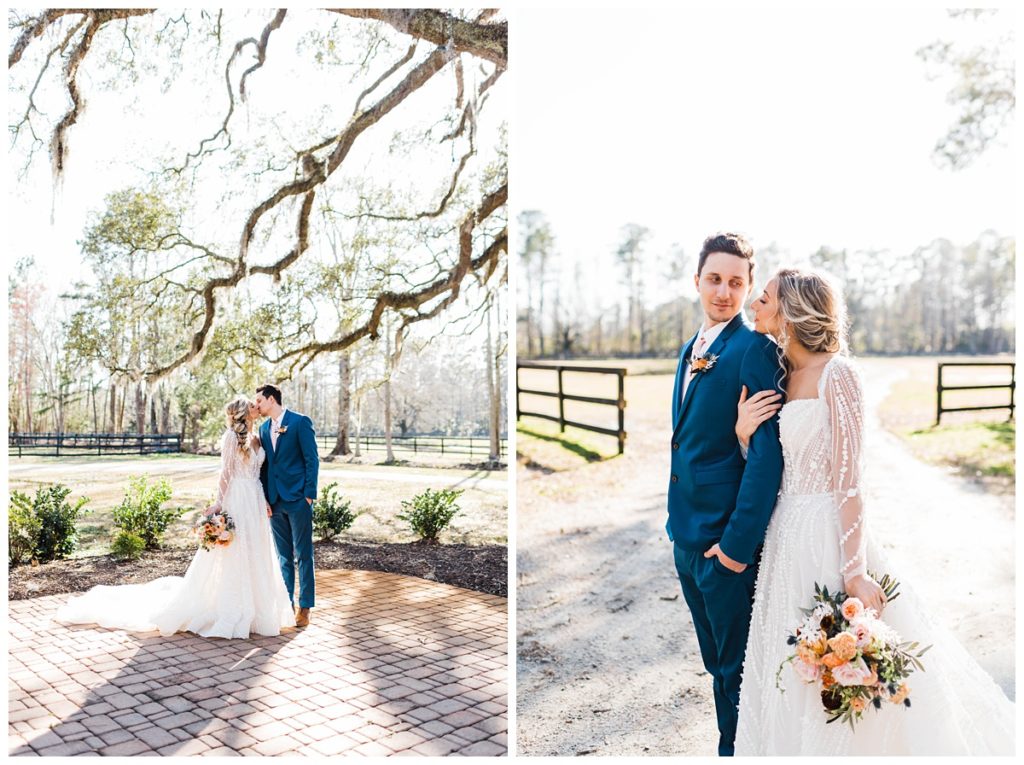
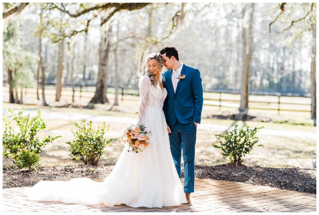
The fun part about planning a styled shoot is that you can share your inspiration design all day long, but you can never QUITE envision how it will turn out until each vendor brings their work to life. Let’s just say when I saw this one coming together, my heart started beating really fast and my jaw basically hit the floor. Every single vendor completely BLEW. ME. AWAY!! Not to mention, all of the ladies who attended the workshop were in complete awe and could not wait to get their hands on every single piece of it! Trust me when I say that I don’t think I have ever heard more camera shutters going off at the same time, haha.
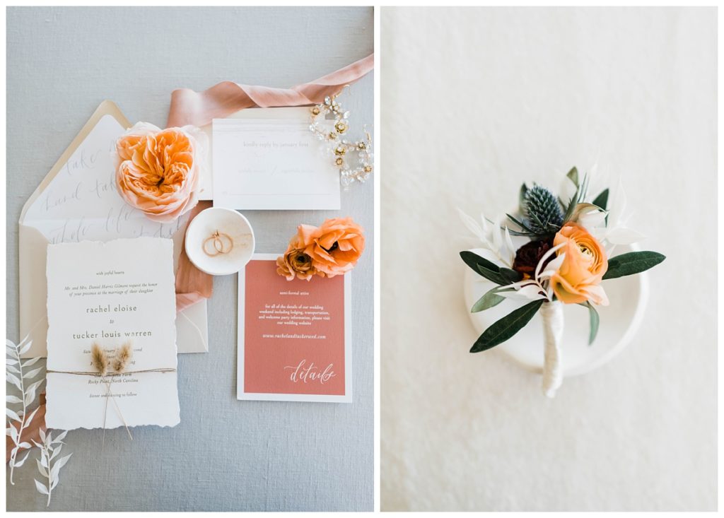
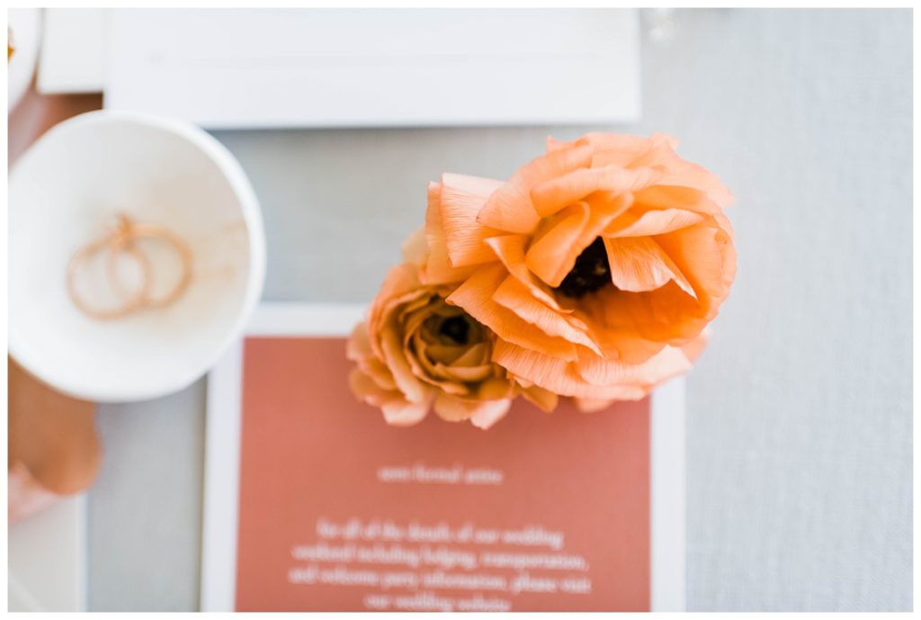
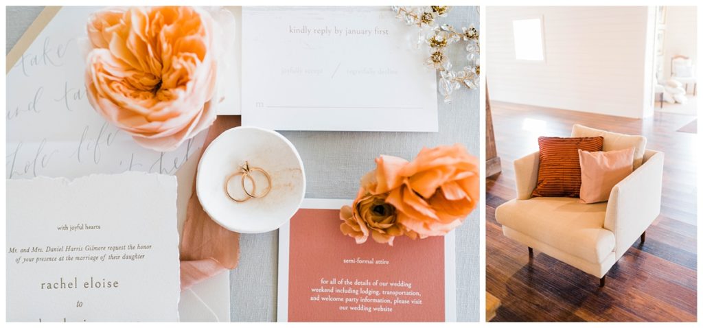
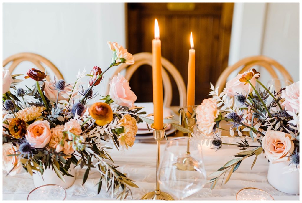
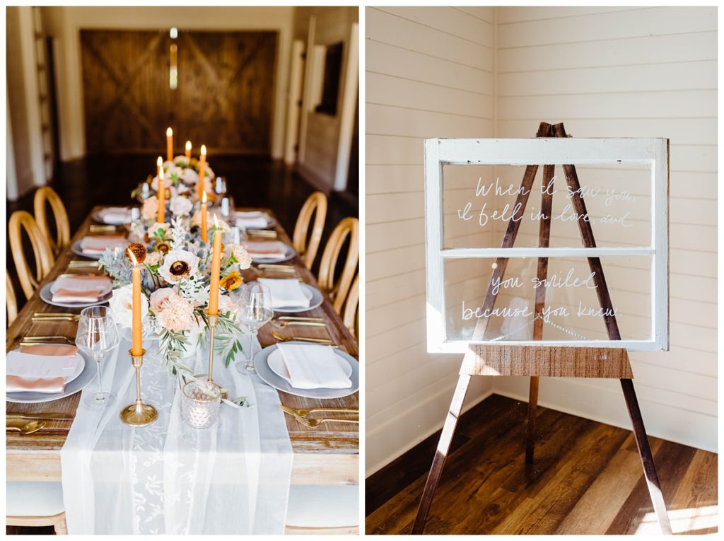
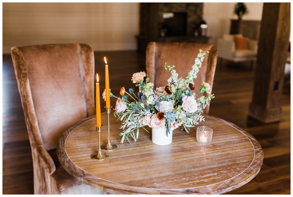
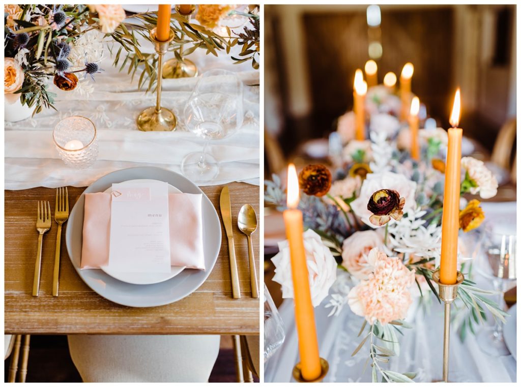
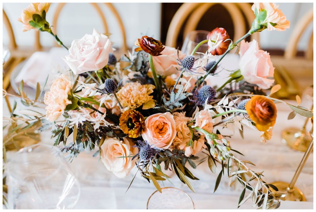
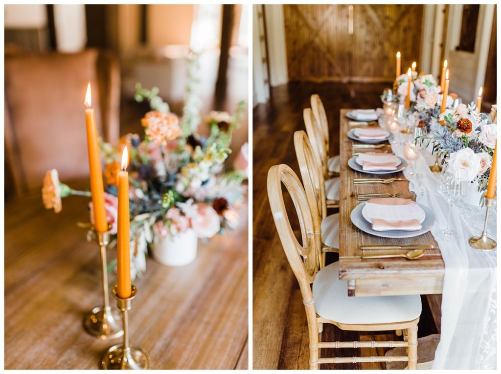
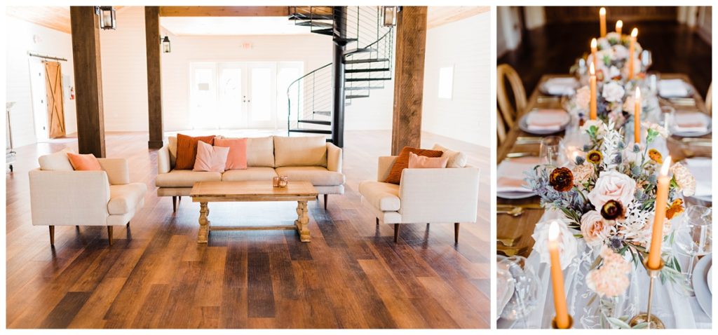
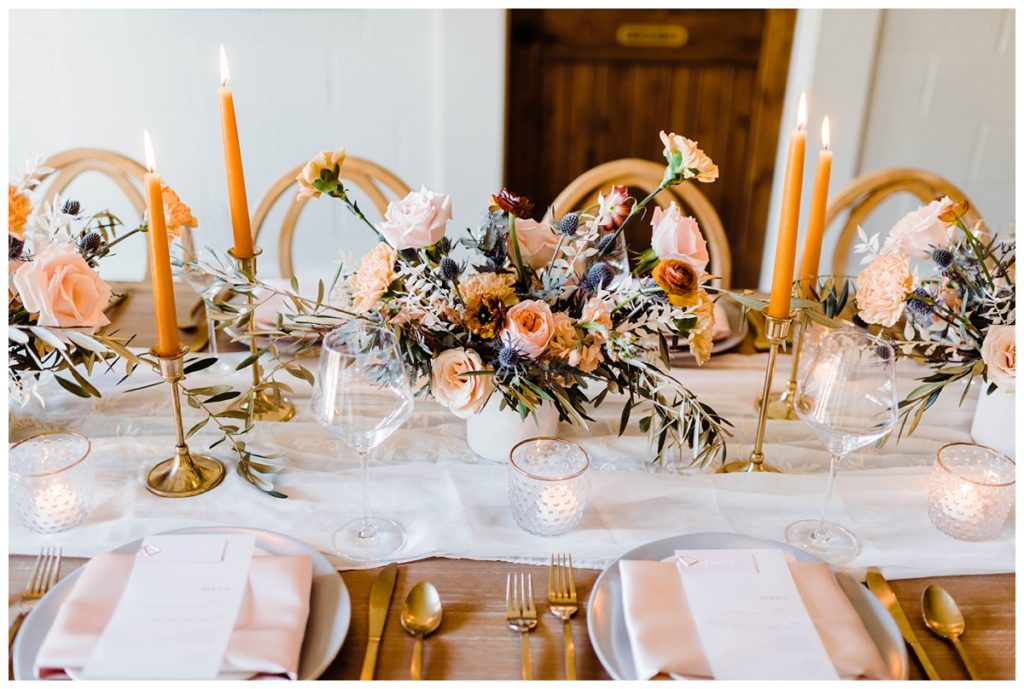
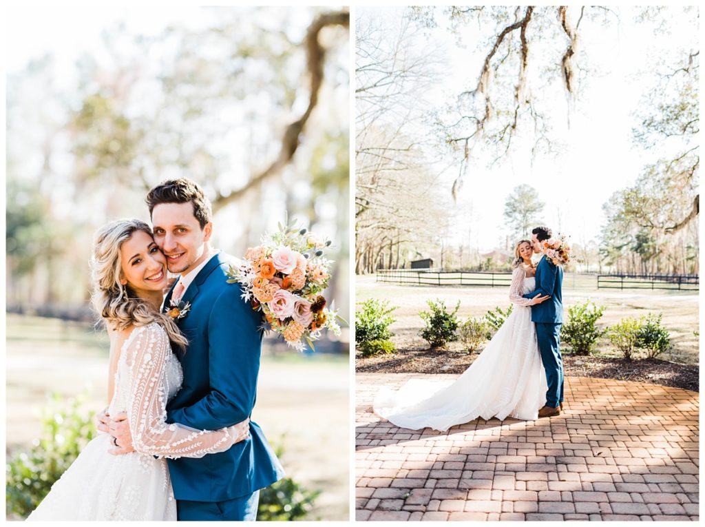
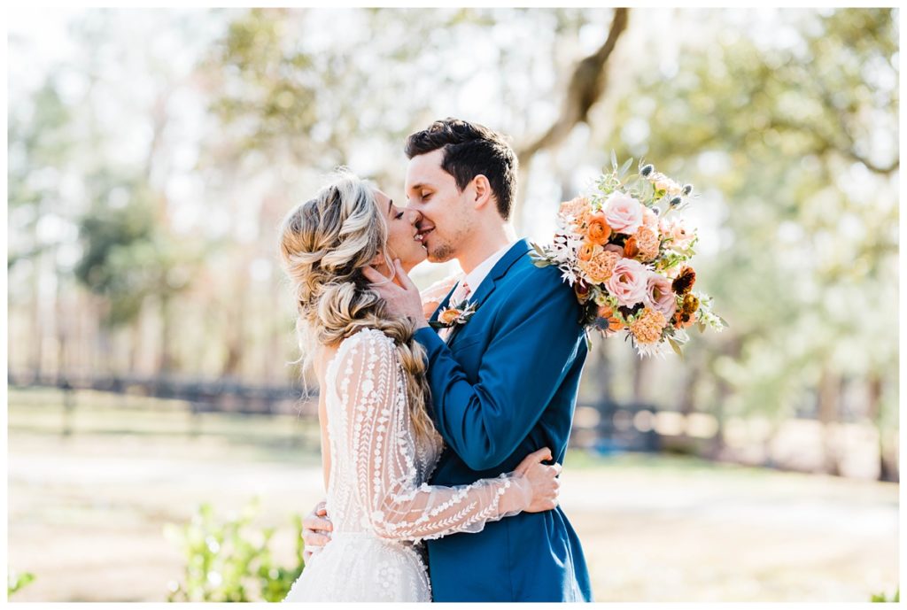
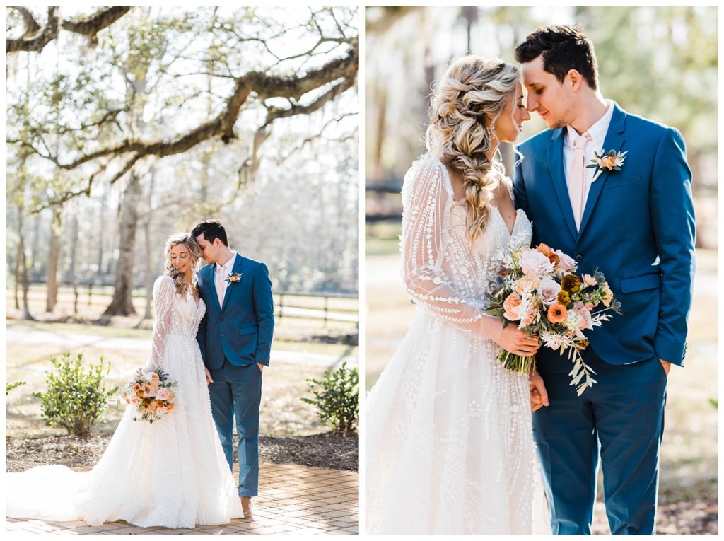
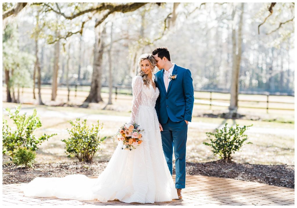
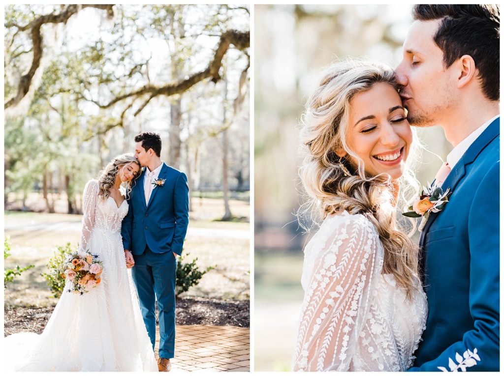
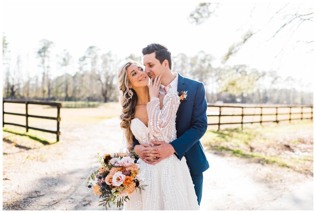
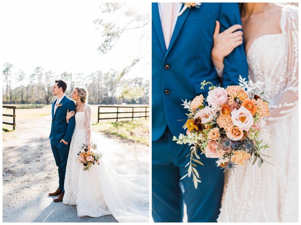
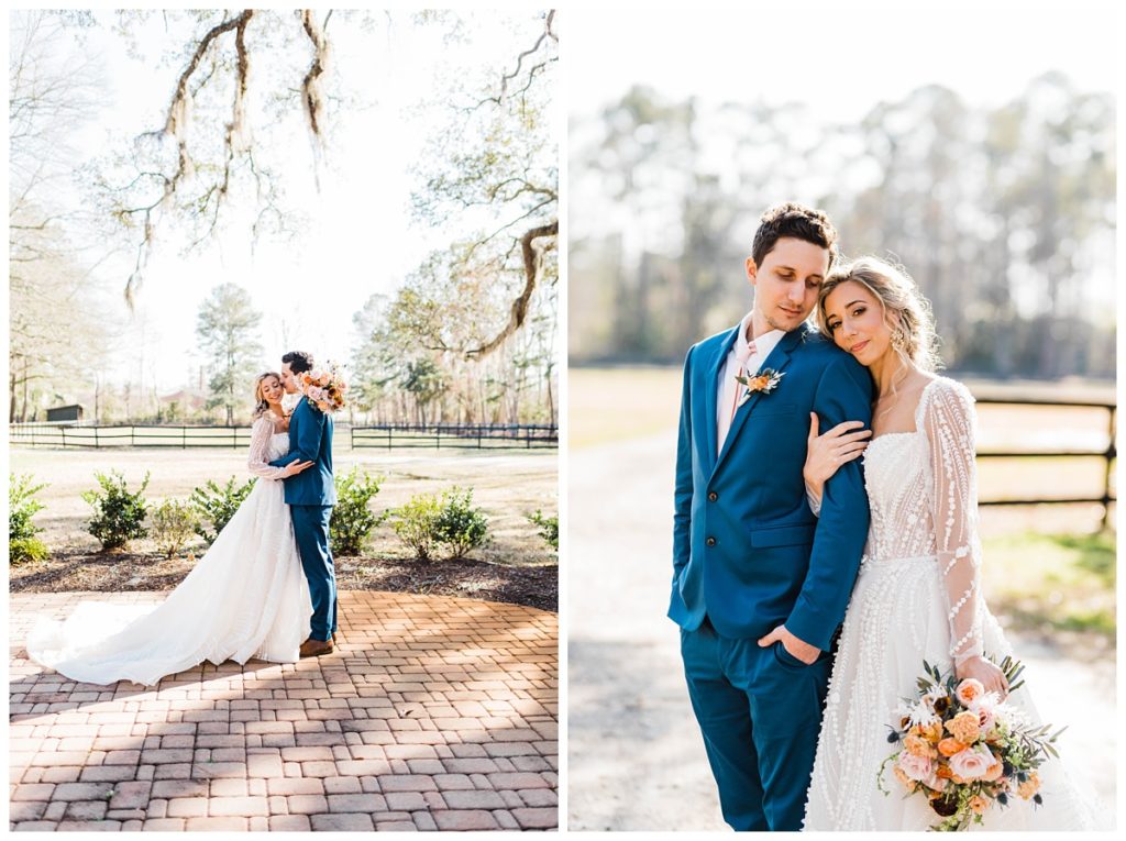
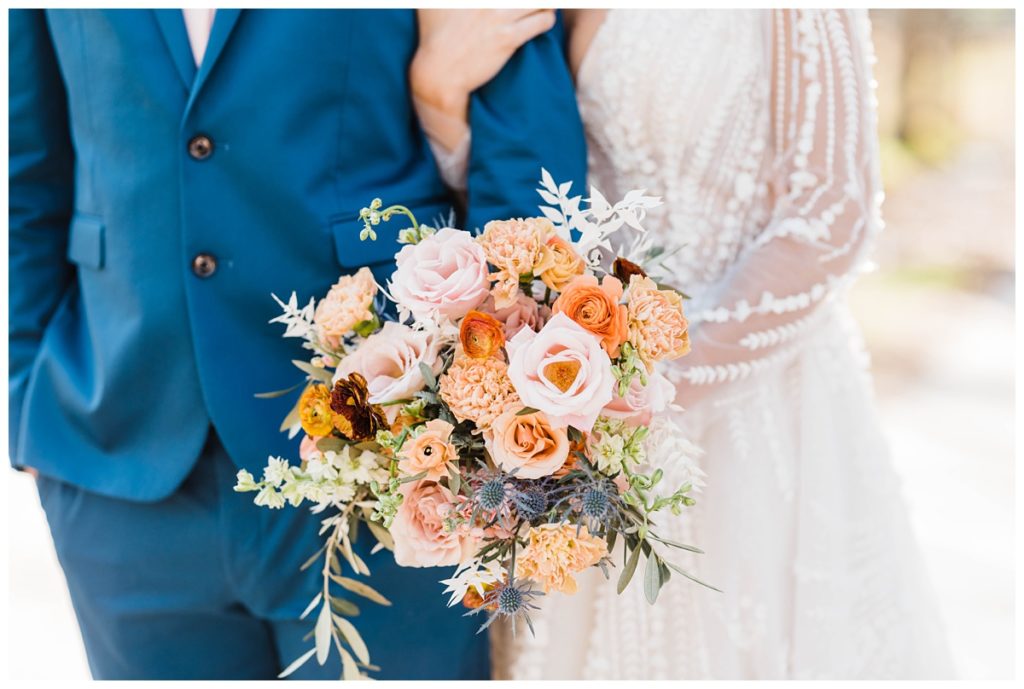
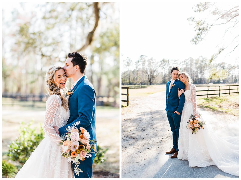
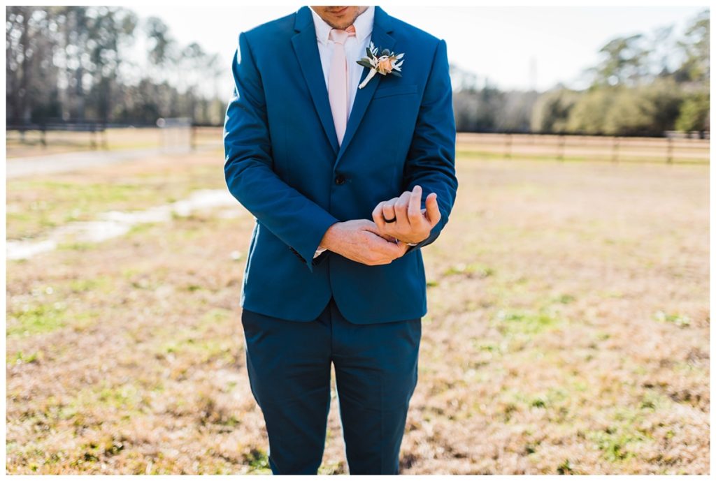
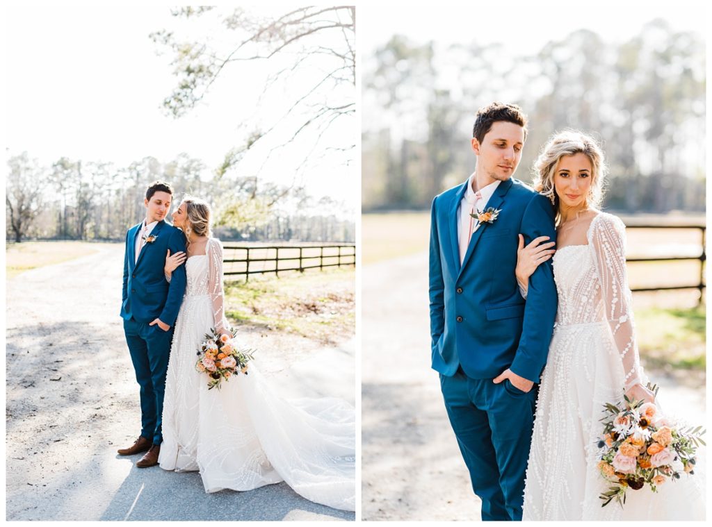
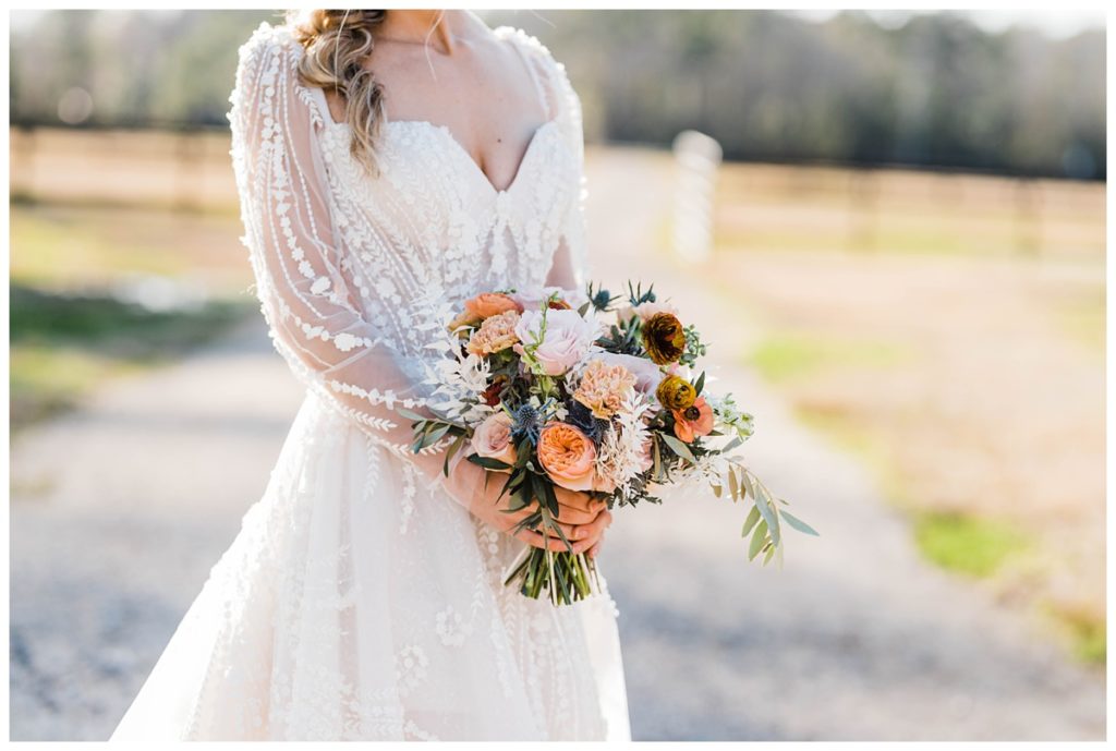
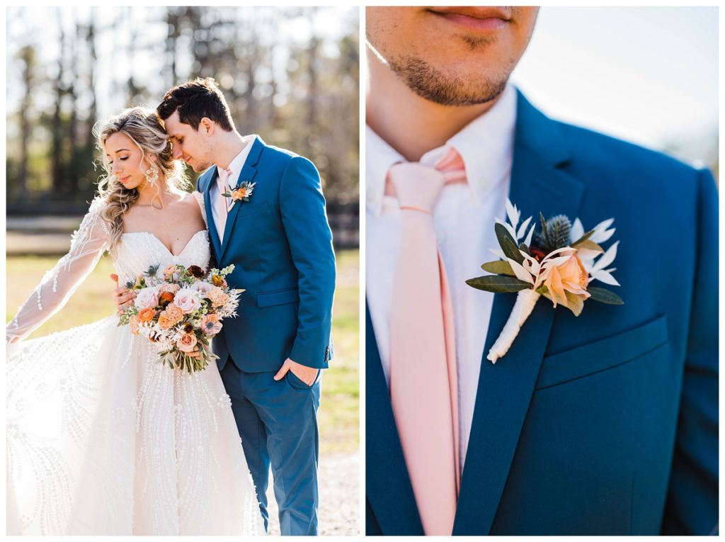
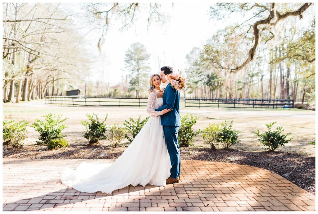
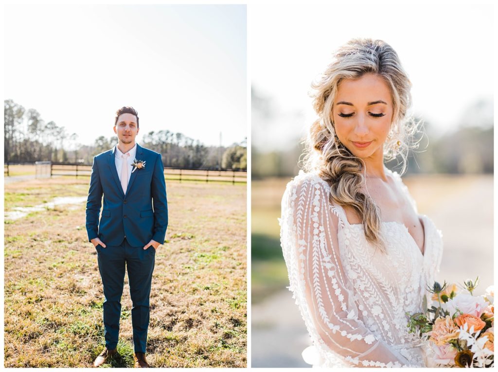
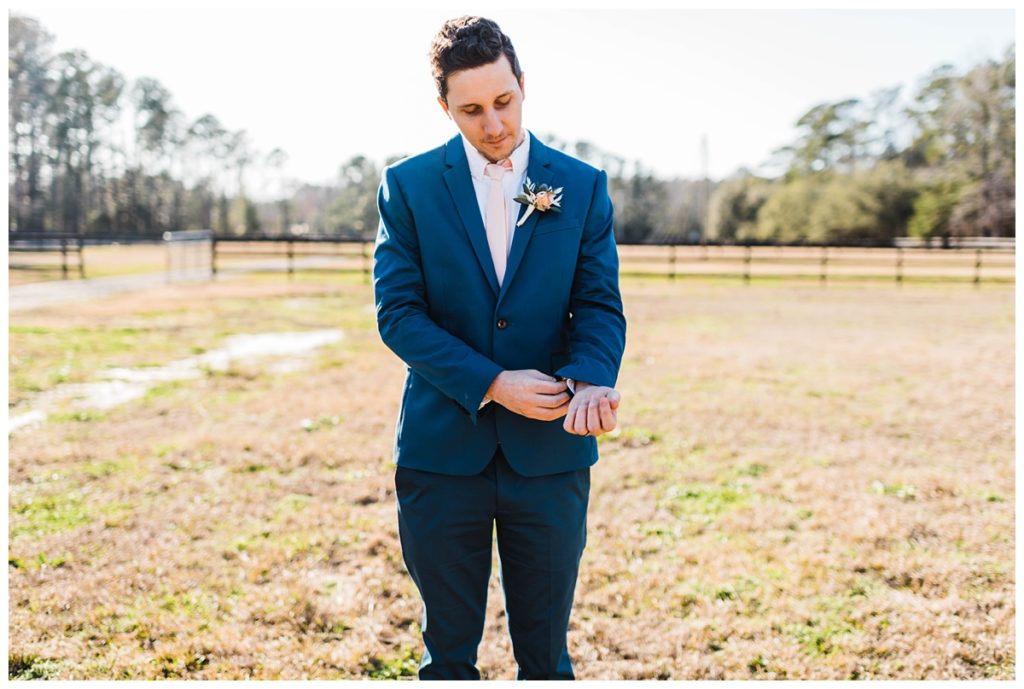
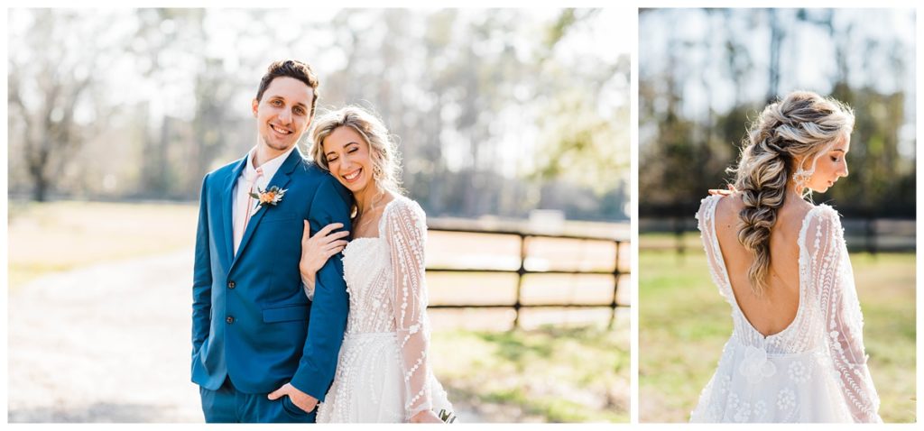
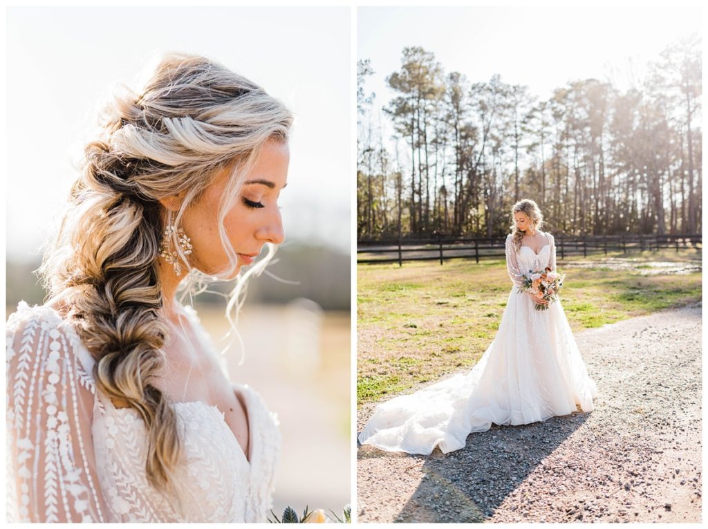
I think what stood out to me the most about this design was the bold, yet neutral color palate. Even though we used some brighter options like peach and burnt orange, somehow the entire color palate remained so neutral and inviting. I could truly see this design used during any time of year…winter, spring, summer, fall. You really couldn’t go wrong! I absolutely LOVE LOVE LOVE getting to shoot COLOR! Super neutral and soft wedding palates are super popular these days and while they are of course still stunning, I get SO EXCITED to shoot images like these. The colors make for such interesting and dynamic shots — yet still remaining timeless and classic. I’m excited to continue shooting all the colors this year when my wedding season kicks off in March!
A VERRRRRY SPECIAL THANK YOU to all of the vendors who made this shoot come to life. I cannot express my gratitude enough! Brides, if you are in need of some vendor recommendations, this DEFINITELY where I would suggest you start. 🙂
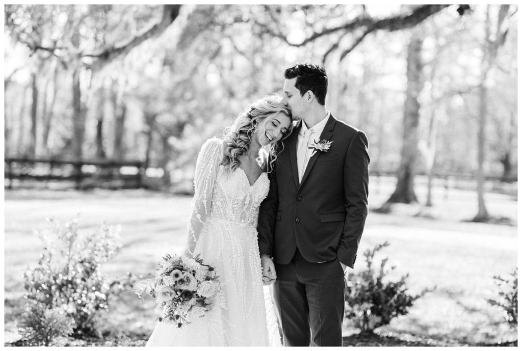
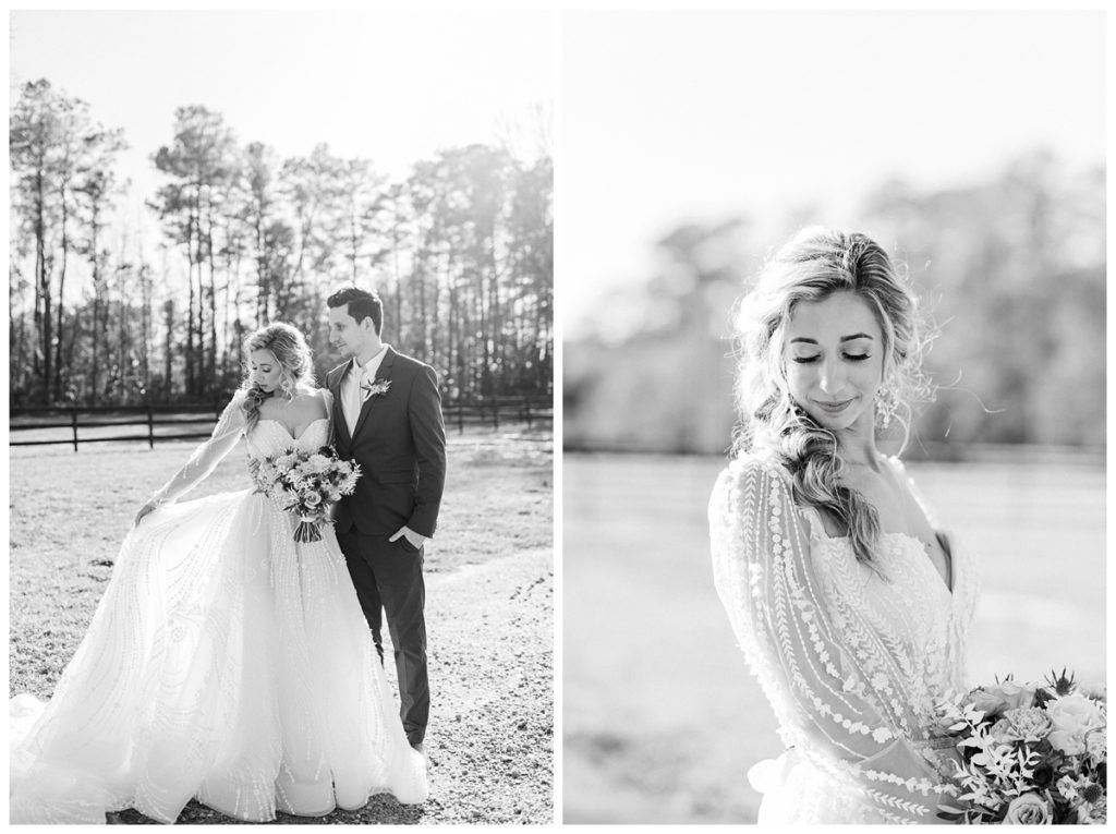
Photographer: Chelsea Allegra Photography
Venue: Old Homestead Farm
Gown: Coastal Knot
Makeup: Seven Makeup and Beauty – Molly Ingram
Hair: Ambiance – Meagan Spivey Burnett
Florals: Designs by Dillon
Rentals: White Birch Rentals
Invitations + Calligraphy: Ivy + Linen Design
Signs + Calligraphy: Handwritings by Hannah
Groom’s Ties: Ties.com
Glassware/Linens/Tableware: Party Suppliers and Rentals